The psychology of color in your optics store
How do you choose the right atmosphere for your optics store? You want customers to feel comfortable, trust your advice, and notice your collection. But how do you translate that into color choices? Color psychology in your optics store can provide valuable guidance, but applying it effectively isn’t always straightforward. At Studio OAK, we create optics store interiors where color, lighting, and sustainable materials all play a key role.
In an optics store, color can be used strategically to influence:
- Trust and calm: Cool colors like blue and green create a calm, reliable atmosphere – ideal for testing rooms or consultation areas.
- Attention and energy: Warm tones such as red, orange, or yellow work well in promotional zones or seasonal displays.
- Luxury and exclusivity: Deep shades like burgundy, dark green, or charcoal convey class and quality – perfect for showcasing a high-end collection.
- Hygiene and clarity: White or light colors emphasize cleanliness and professionalism – especially important near medical equipment or eye-testing areas.
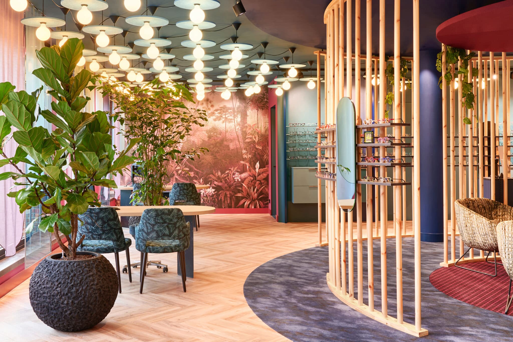
The role of color psychology in store displays
Color isn’t just decoration, it’s communication. Colors have the power to evoke emotions, influence behavior, and even guide purchasing decisions, often without people realizing it. In an optics store, this is especially important: customers aren’t just buying glasses, they’re looking for trust, expertise, and personal attention. The right color choices can subtly strengthen that feeling – or, if done poorly, unintentionally work against it.
At Studio OAK, we believe color truly works when it aligns with your brand story. That’s why we first explore the identity of your optics store. What do you want to convey? How do you want people to feel when they walk in? Based on that, we make design choices for your store that go beyond style, choices that shape the experience while perfectly matching your brand.
Examples include:
- Using color contrasts between furniture and background to make products stand out
- Keeping neutral tones at eye level so frames don’t visually “compete” with their surroundings
- Applying accent colors to guide customer flow or highlight promotions
- Combining natural materials with soft tones to create a warm, accessible atmosphere
Color and product presentation
In an optics store, it’s all about seeing and being seen, and that goes for your collection too. The way products are presented is just as important as the products themselves. Color psychology plays a surprisingly big role here. The right colors can create a high-end look, bring calm to the display, or draw attention to key eye-catchers in the interior.
At Studio OAK, we design the complete store interior, including how eyewear is presented. This means smart material choices, surprising color combinations, and thoughtful placement that strengthens your brand identity. From layout to atmosphere, and from lighting to overall experience, every detail counts.
Examples of color use in product presentation:
- Dark background with light frames – luxury and focus
- Soft pastels around children’s frames – playfulness and friendliness
- Monochrome color schemes – calm and clarity, especially for large collections
- Thematic colors per season or style segment – more engagement and better segmentation
Looking for inspiration? Explore our projects or get in touch for tailored advice on color use in your optics store.